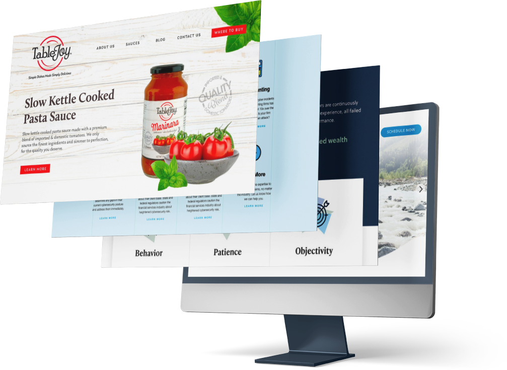
A collection of websites I've designed and developed from the ground up — partnering closely with clients to translate their brand and goals into clean, considered digital experiences. All four were built on HubSpot, using a combination of the CMS builder and custom HTML/CSS to bring each design to life.
Each project reflects my full range: from early client discovery and visual design through hands-on development, with an eye for detail that carries all the way to launch.

I owned the design and development of this site end to end, partnering closely with the client from our very first conversation through launch. Working within their existing logo and brand colors, I expanded and refined their visual identity into a cleaner, more modern system, developing an expanded color palette and pairing fonts (IvyPresto and Soleil) to set the tone.
From there, I translated that direction into wireframes, then a hi-fidelity mockup, iterating with the client at each stage to make sure the site felt true to their brand. Once approved, I built the final site myself on the HubSpot CMS, adding custom animated SVG icons and subtle motion throughout to give the experience a more dynamic, polished feel.


I led the reimagining of my client's online presence to be sleeker and to better showcase their range of medical services while keeping their existing branding and fonts intact.
Working from my team's content plan, I designed the site and developed it on the HubSpot CMS. I managed the site both before and after the refresh, handling ongoing updates and changes as the client's needs evolved.


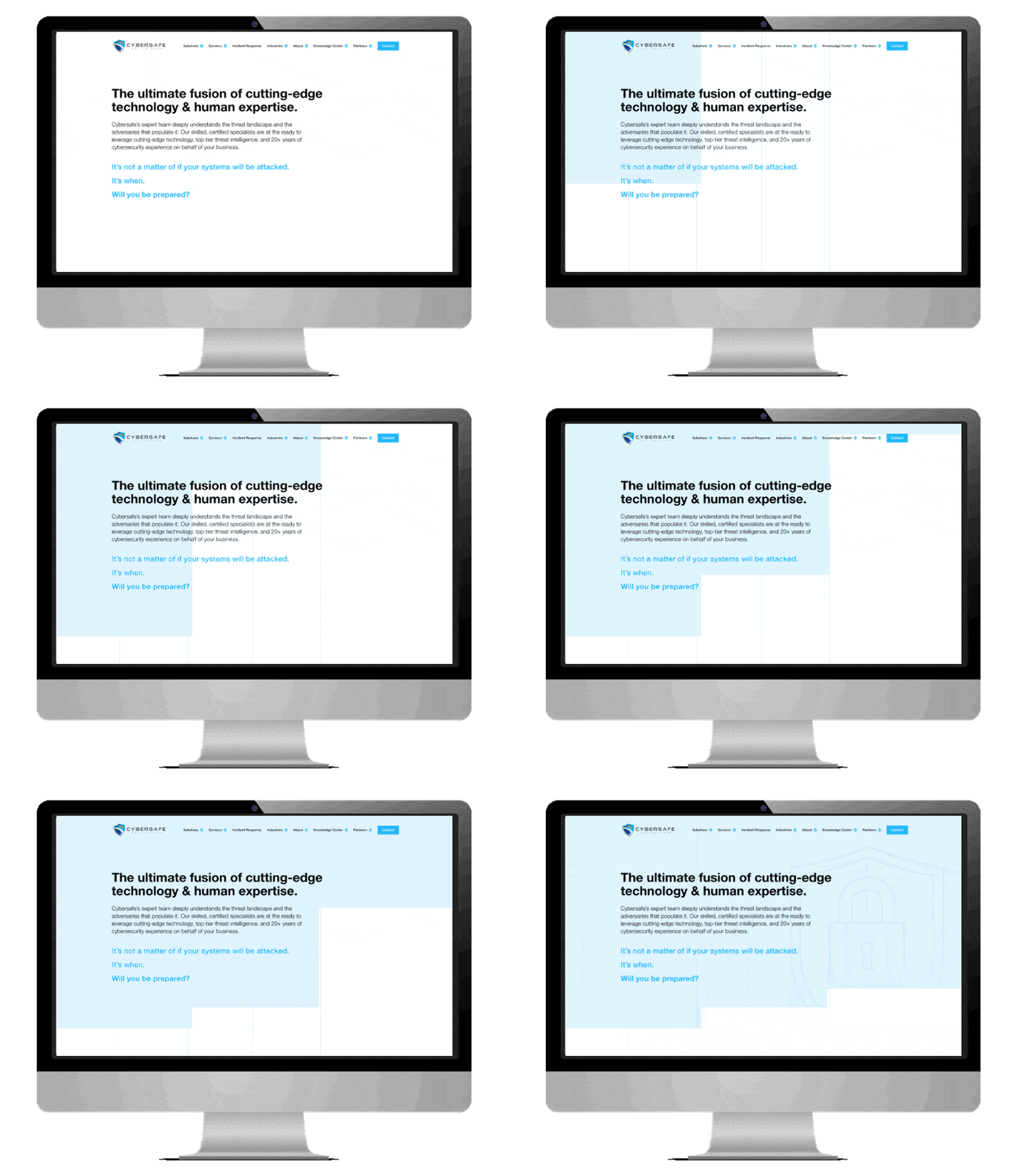
I designed this concept as a proposal for Cybersafe Solutions' website redesign, reimagining their dark-themed site as a light, clean experience true to their brand. The mockup was designed in Adobe XD with an intended build in the HubSpot CMS. While the project wasn't ultimately built out, the design reflects my approach to translating brand direction into a distinct visual identity.


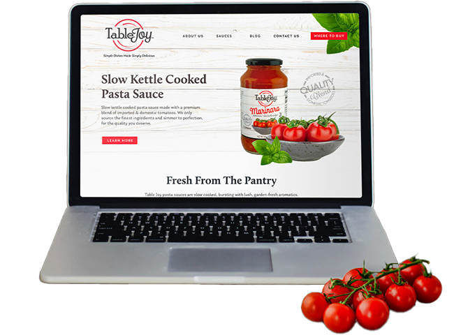
I designed and built this one-page site for L&S Packing Company to introduce TableJoy, a brand-new pasta sauce line, to the market. Working from the branding team's visual assets, product photography, and nutritional details, I translated their materials into a clean, purchase-ready web experience using bright colors pulled from their brand palette. Each sauce offering opens into a lightbox with full product details and a path to purchase, keeping the page simple while still giving customers everything they need to make a decision.